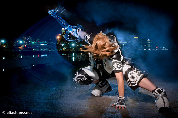
I have been photographing my friends in their anime and game inspired costumes (cosplay) for many years. Recently, I’ve wanted to ramp things up, and take more dramatic images that stand out from what I’ve done in the past. A couple of months ago my friend K, one of Australia’s foremost cosplayers, approached me to ask for help shooting a photo for a charity cosplay calendar she was invited to appear in. I took this opportunity to push my boundaries, and I was very happy with the results:
I’m going to do a brief description of how this photo was created, talk about the shoot and show you a couple of other images we took.
For this shoot I was joined by a second photographer, my good friend Elias Lopez. Typically at a cosplay photo meet, a bunch of cosplayers and photographers get together and everyone takes lots of casual photos. The idea with this shoot was to be a lot more focused, and to achieve just a handful of very specific image ideas. Before getting to the location, I had an image in my head of the photos I wanted to create, and an idea of how to execute them. Elias also had a couple of ideas for shots, and we took turns getting them just right. As such, the process was very deliberate and precise, and we took our time to get exactly the look we were after. I found this method of working highly rewarding and ultimately achieved a better result.
Here is a lighting diagram for the photo above:

Lighting diagram created with help from http://www.lightingdiagrams.com/Creator
One of the main elements that sets this shot apart from others is the glowing blue streaks the keyblades (the swords in the model’s hands) leave through the image. These were achieved by taping electroluminescent wire to the props, and the model sweeping them through the shot while the shutter was open.
- With the camera on the tripod, the shot was composed with the model standing in place. This allowed me to create a balanced composition that took into account the city behind.
- The aperture was set sufficiently wide to blur the city behind so that it wouldn’t distract from the foreground.
- The shutter speed was found through trial and error to be long enough to allow for the keyblades (the swords in the models hands) to ’streak’ through the shot.
- ISO was set to 400 to allow wiggle room either side if I needed to boost or suppress the exposure.
- The three flash units were all set to approximately the same power level, tweaked to balance the exposure of the subject with the background. The flashes froze the model, even though she was moving during the exposure to create the light trails. This created a problem that needed to be fixed in post; discussed below.
- The camera white balance was set to tungsten, to give it the blue look we wanted. This can be done in post, but I find it helpful to visualise the shot on the back of the camera with an approximate white balance that I will use for the final result.
The final exposure settings were: 0.6sec at f/5.0, ISO 400, 105mm.
You can see a short behind the scenes video taken while I was getting test shots to establish the right exposure for the city and e.l. wire here: Behind the Scenes on a Cosplay Photo Shoot
Many exposures were taken of this setup to get just the result we were looking for. Here’s an example of some of the rejects, as they came out of the camera:

As you can see from the above photos, the result out of the camera looks good, but needs work to polish it properly. I process all of my photos in Adobe Lightroom. Usually this is enough, but the artistic demands of this photo required some additional photo-manipulation work in Photoshop. Below is the sequence of the photo at the different stages of processing.
Stage one: This is how the photo looked straight out of camera.
Stage two: Processing in Lightroom increased the brightness, contrast and saturation and selectively brightened the face.
Stage 3: The final image after editing in Photoshop. Here the background was darkened slightly to make the subject stand more separate from the background. The weeds on the ground were deleted, I selectively enhanced the streaks to make them glow even more, and I deleted some background lights that were either two bright and distracting, or appeared to show through the model; the result of her moving after the flash had fired.
This photo, out of the several that we created on the night, was selected by K to be her submission to the calendar. The calendar is now available, and is raising funds for the Room to Read charity, promoting child literacy. It’s an amazing calendar with great photos of incredible cosplayers, and it’s raising money for a great cause. It’s available at a good price, so everyone should order one! You can read more and order your copy here: http://causeplay.org/2011-cosplay-calendar-for-charity/
Here are some of the other photos we made on that night. Click them to go through to a more detailed description of how they were made.
The following photo by Elias Lopez.
In conclusion, this shoot was immensely satisfying. Working with a very creative and motivated team of people, to create images with such great visual impact, which ended up in an internationally sold charity calendar was all very rewarding. I have become even more determined to spend more time working on photo shoots more like this: ones that are driven by a specific creative vision, rather than just the desire to take pretty photos as the opportunity is presented to me.
Post from: Digital Photography School


No comments:
Post a Comment